

Updated 1 week ago
Coffee Box With Logo: Printing Process, Finishes and Price.
ypak.coffee
YPAK PACKAGING GROUP was established in 2011 and formed with 3 companies based on Hongkong, Dongguan and Foshan. We have become one of the largest coffee bag manufacturers in China. We use the best quality WIPF valves from Switzerland to keep your coffee fresh.
Conform to the plastic ban policy imposed to many different countries, we have researched and developed the sustainable packaging bags, such as RECYCLABLE and COMPOSTABLE pouches.
No minimum quantity, no color plates are required with our HP 25K INDIGO DIGITAL PRINTING service.
You are welcome to visit YPAK.

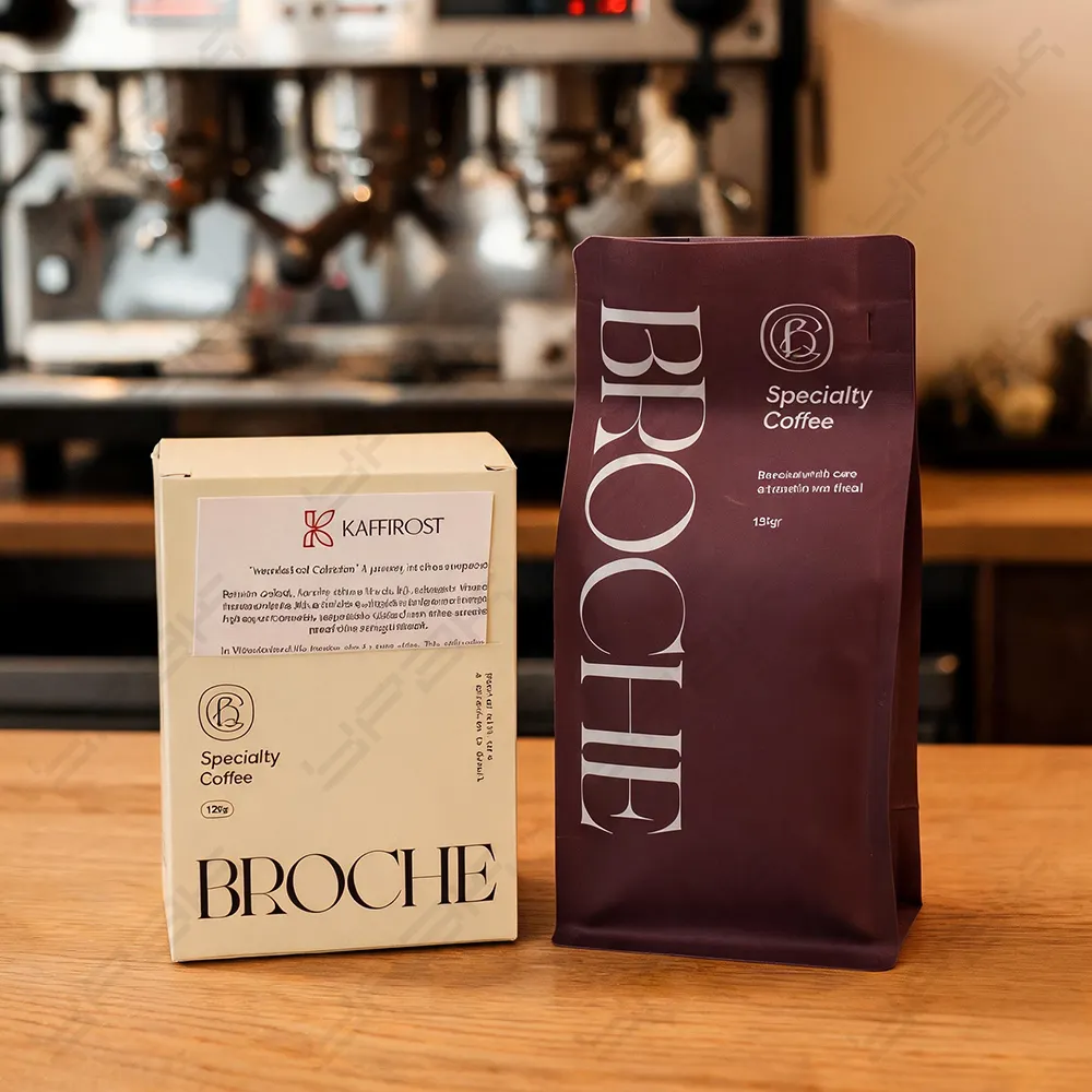
coffee box with logo
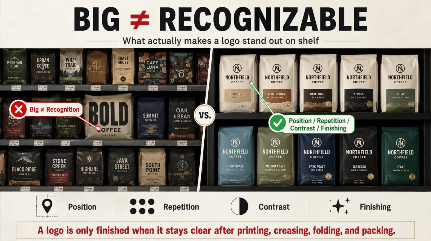
The brand needs to be recognizable by a coffee box bearing a logo without compromising on information and physical performance of the pack. The logo must be legible following printing, creasing, folding and packaging and the appearance must be deliberate upon initial eye contact with the customer. Big does not make recognition. Position, repetition, finish and contrast used throughout the coffee range are also very crucial.
In the case of specialty coffee, sealed bag of beans, drip sachets or a gift pack are often placed in the outer box. The inner package is the one that offers the primary barrier of freshness. The box provides the logo with a bigger display area, arranges the items and links the products that might look up to varying pouch sizes. Logo planning must commence with such a commercial role as opposed to ornamentation.
Determine the Job of the Logo.
It is important that you determine the logo goals that the logo must achieve on this specific box before determining the printing process to use. A coffee retail carton, subscription mailer and corporate gift set greet customers in their various environments. Both must have a balance of instant recognition, product description and high-end description which favors one or the other.
The First View Recognition
Identify the main viewing panel, and the normal distance that it is viewed. A logo on the shelf should not be confused with the other products due to the inability to read. A mailer can look at you initially at the top, whereas a drawer box might only present the best brand moment upon opening. The main mark has to be on the panel that will be sure to reach the customer to be the first one.
Connection across the Coffee Range
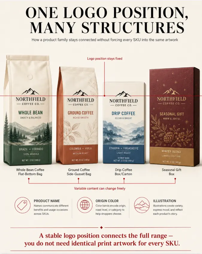
Whole bean, ground coffee, drip coffee and seasonal gift products in various differing structures can be linked with a stable logo location. It may be surrounded by product names, colour of origin and illustrations that are changed. This will give a familiar system without imposing the need to use the same artwork by all SKUs.
Set up Production-Ready Logo Assets.
A supplier will not be satisfied with a logo found in a Web site. The geometry, color and legal variations must be determined by production files. Early supply of these assets thwarts the converter refreezing the mark or making some decision without approval when the artwork goes to prepress.
Give References of Vector and Color.
What sharp edges are of different sizes, use an editable vector file. Add CMYK colours, codes for Pantone when colour is vital to brand and one-color or approved black and white. When providing raster effects, they must be at final size and appropriate resolution. Screen RGB value does not correspond to a standard color.
- Primary horizontal and vertical versions of the logos.
- The minimum size of reproduction and the clear-space rule.
- Positive, reversed and single-color artwork
- Pantone color values, CMYK and digital color and values approved.
- Guidelines when putting the mark on the image or kraft paper.
Remove Unsupported Detail
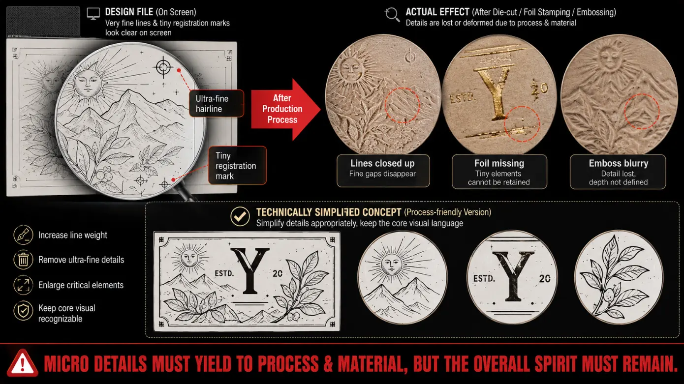
Hairlines and minute registered symbols, which may be closed when cut or removed in foil, may be embossed or stamped. When a conceptually reduced version of production is needed. It cannot be allowed to become significantly different, yet its minute details need to be conducive to the process and substrate selected.
Place the Logo on the Dieline.
The logo is done on a plain sheet, but evaluated on a box that is 3-dimensional. The placement of dielines should consider the curved, overlapping panels, which can curve in or close to the side closures (and folded panels) or sit side by side. One or a visual misplacement on the artwork piece can be visually displaced when the carton is assembled.
Develop Structural Safety Zone.
Store critical logo information out of cut edges, crease lines, glue flaps, thumb notches and locking tabs. The distance necessary is a result of the tolerance and mark size conversion. Wrapped edges and corner turns required on rigid boxes, too, since artwork may shift due to paper mounting.
Check Orientation using a White Sample.
Trace the logo location on a blank blank structure sample, prepare it and fill with actual coffee product. See all the openings directions and ensure that the mark is straight. This basic verification can detect inverted sleeves on the drawers, inverted lids and concealed labels or shipping seals with a logo till it is authorized to be printed.
Select Logo Treatment.
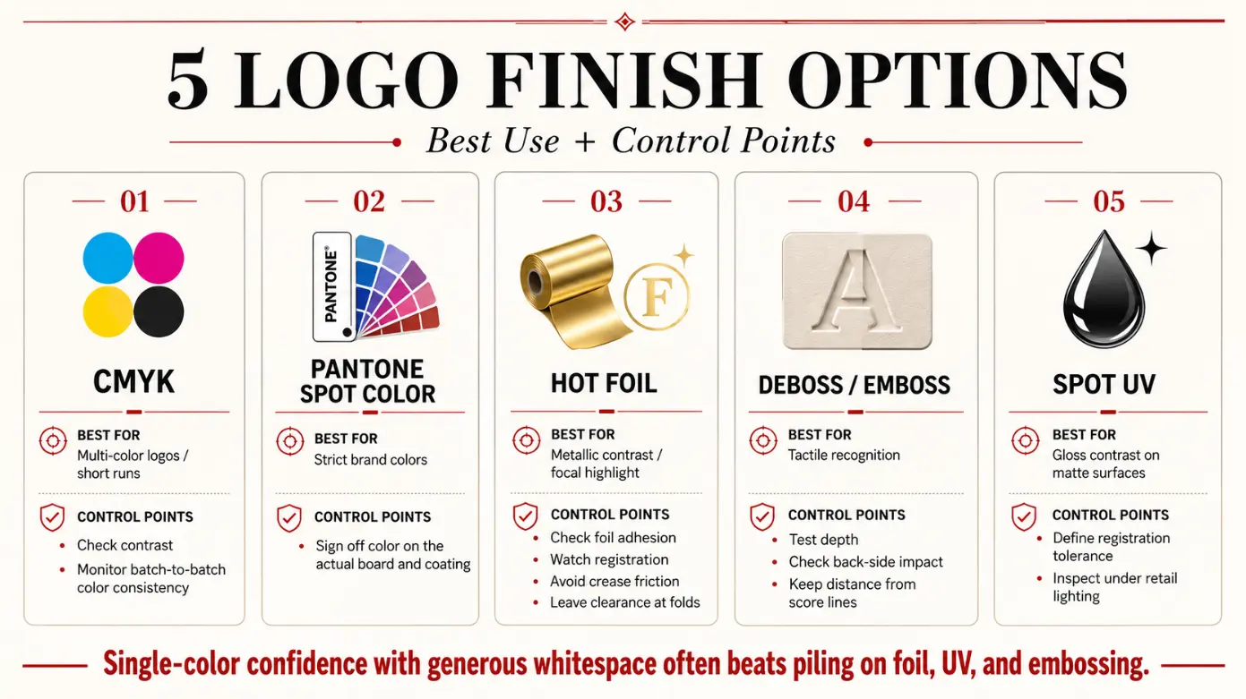
The logo treatment must be suitable to brand character, equipment to be used (run size), paper surface and its anticipated handling. The following enlisted choices undertake various tasks and ought to be contrasted using a canvas box and not solely using digital mockups.
| Treatment | Useful when | Control point |
| CMYK or computer-generated color. | The logo falls in the variable shorter runs or full-color artwork. | Confirm contrast, small-large detail reproduction and batch color reference. |
| Pantone spot color | An accurate corporate colour has brand name. | Accept the colour on the board chosen and coating. |
| Foil stamping | Metallic contrast sustains an exquisite focal point. | Check foil sticking, registration, fold rubbing and fold clearance. |
| Emboss or deboss | It matters: Tactile recognition. | Depth of the test, back impact and dissimilarity to scores. |
| Spot UV | The contrast of gloss must be over a non-glossy surface. | Determine registration tolerance, and check under retail light. |
A treatment need not be complicated to be unique. A logo of one color, with confident spacing of these colors can perform better than a crowded duo of foil, UV and embossing. Choose one of the primary impacts and leave the panel around support it.
Construct Contrast on the Chosen board.
Paperboard modifies the appearance of a logo. Bright color and neat edges are normally achieved with white coated stock. Transparent inks can appear to be warmer, and less saturated, when made in natural kraft. Recycled or textured surfaces can cause minor differences that would suitably fit in one brand style, and would not fit in another.
Make a decision on whether to continue with white ink or not.
Color can be retained with a white underprint on kraft or dark material and this provides an extra production step and additional registration. Another solution would be to make the color of the solid dark spot of a logo or the reversed one that welcomes the board in the visual system. Compare physical samples and commit.
Maintain Legibility Finished
Matte lamination can also benefit the contrast and gloss can create the reflections. The soft-touch surfaces are able to convey high-end quality but must be examined on dark spots of rubbing and print left by fingers. Its finish should not occupy small crevices and transform a small logo into one that is hard to take a photo or scan on the Internet.
Stability of Control Logo.
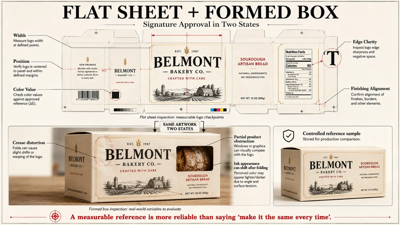
Consistency is established by references that are measurable, as opposed to requesting each production run to appear the same. Approval file must refer to the revision of the artwork, the board, and the color target, method of printing and acceptable & finish registration. Have an approved box in regulated storage to compare.
Check the Investigate as an Independent Characteristic.
Check logo width, position, color, edge definition and finish alignment, during sampling and production. Examine flat and boxed sheets. An ink mark can be transferred onto a sheet but it gets twisted due to a fold or it can be hidden in part when the product is packed.
- Check proper version of logo of each SKU.
- Determine position based on predetermined cut and crease markers.
- Optity to scan any QR label or miniature digit next to a mark.
- Coats foil Periodically, rub-test and then ink dark.
- Logging of lot information in records which will be used later.
Learn the Price of a Logo Box.
A coffee box with logo is not only dependent on ink coverage when it comes to cost. Board, structure, number of pieces, proofing, printing arrangement, stamping equipment, embossing die, and coating, assembly and packing are contributions. An all-printed logo could be cost effective using a lot of SKUs whereas a new finish could bring up a different minimum or set up every design.
Separate Unit Cost of Brand Investment.
When the building and mark is consistent, artwork preparation, cutting tools and embossing or foil dies can be early investments. The run-to-run times can repeatink, setup, finishing and inspection. Ask to be quoted a quote that cites reusable tools, ownership, period of storage and conditions of replacement.
Take into consideration Version Risk.
Drinking outdated boxes can be overnight by altering a logo, certification mark or legal line. With variable information they can contain on labels, sleeves or inserts, the permanent logo can remain on the box and the changing product can be labeled. The savings resulting due to a large order are not really saved when not all of the inventory is used.
Pair a Logo Box with YPAK.
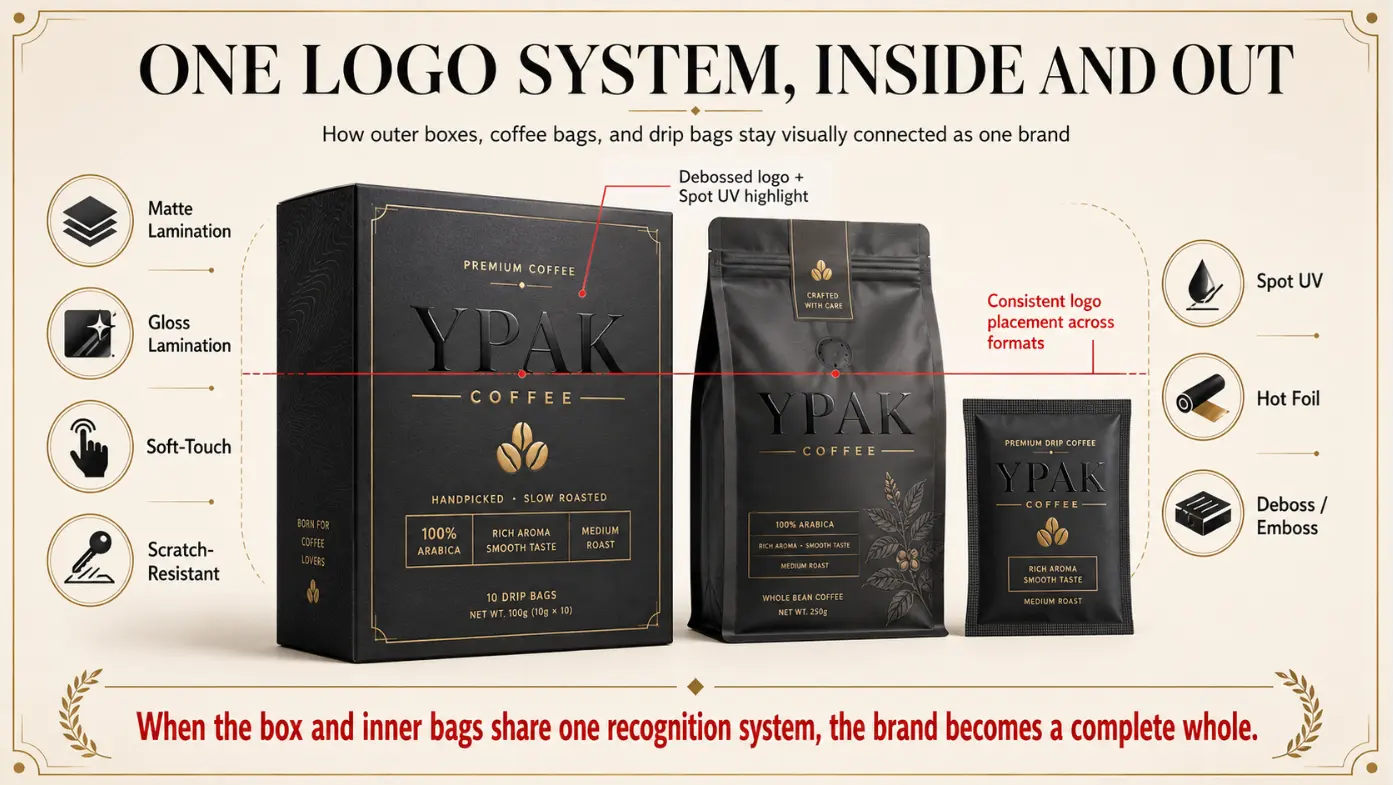
YPAK manufactures custom print coffee box solutions with custom print options in terms of size, color, logo, illustration and finish. Its drip coffee package containers can incorporate printed boxes, sachets, pouches and fitted interiors and effects that can be used include matte or gloss lamination, soft touch, anti-scratch coating, spot UV, foil stamping, embossing and debossing.
An effective request ought to comprise of the producer logo, color cues of the brand, box design, product filled size, position of the logo, completed artwork, quantity per design and the target store or delivery channel. The idea to have the logo reviewed on both the box and inner coffee packaging would be helpful in producing a single recognizable system rather than individual part sharing a single color.
Conclusion
The logo of a winning coffee box is also a successful treat to the mark as a feature of production. The board and box structure is chosen based on its geometry, color, location and finish then validated on an assembled and packed sample. This safeguards first-order recognition with reorders of later.
The best treatment is one that is recognizable by the customers and can be recreated by the supplier. Physical separation of references and cost, and clearness of artwork are the reason why a coffee brand can commit to visible quality without causing an undue set up, inventory or finished good risk.
FAQ
The questions below are some of the answers regarding general decisions about logos prior to the production of a custom coffee box.
Written by
ypak.coffee
ypak
YPAK PACKAGING GROUP was established in 2011 and formed with 3 companies based on Hongkong, Dongguan and Foshan. We have become one of the largest coffee bag manufacturers in China. We use the best quality WIPF valves from Switzerland to keep your coffee fresh.
Conform to the plastic ban policy imposed to many different countries, we have researched and developed the sustainable packaging bags, such as RECYCLABLE and COMPOSTABLE pouches.
No minimum quantity, no color plates are required with our HP 25K INDIGO DIGITAL PRINTING service.
You are welcome to visit YPAK.