Starbucks New Coffee Packaging Guide
You may have noticed something new when you last shopped for coffee: A new design from Starbucks. What you see is brand-new at-home coffee packaging that not only looks different, but is designed to enhance the whole consumer experience from purchase to consumption.
Here’s a complete breakdown of the new Starbucks coffee packaging, including its use of color, roast levels, sustainable design and storytelling.
The Need for a Coffee Packaging Refresh
Today's grocery aisle is overstuffed, and consumers make decisions fast - in less than 60 seconds, in fact. In response, Starbucks sought to make its coffee easier and quicker to select.
The aim of the new design is three-fold:
· Simplifying product discovery
· Enhancing visual storytelling
· Enhancing transparency and sustainability
Through design and functionality, Starbucks has made it easy for customers to select the coffee they want based on their taste, budget and other factors.
New Starbucks Coffee Packaging Highlights
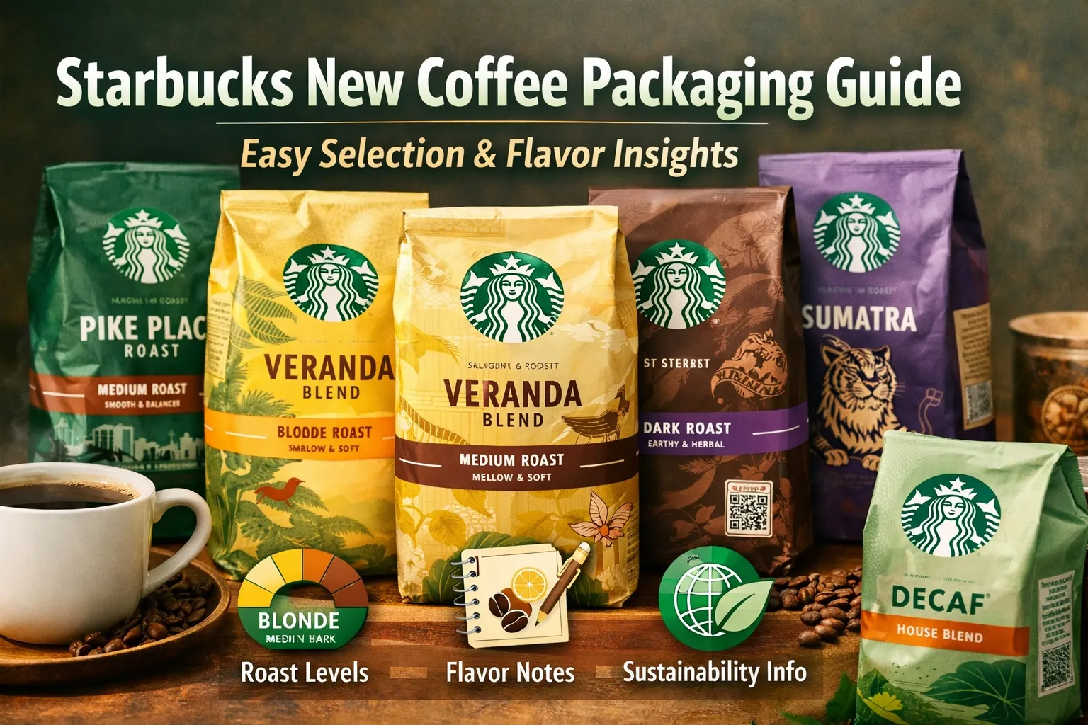
1. Color Codes for Quick Recognitions
Perhaps the most obvious change is the addition of color as a decision-support system.
· Dark green → Coffee
· Light green → Decaf coffee
This color-coded approach provides a quick visual cue to help customers identify whether a beverage is caffeinated or decaffeinated.
2. Simplified Roast Levels
Starbucks now offers a roast spectrum guide to indicate the intensity of coffee flavour.
· Blonde Roast (Yellow) → Light, smooth, mild
· Medium Roast (Brown) → Medium, smooth
· Dark Roast (Purple) → Full bodied, rich, inky
The roast level is accentuated with a coloured band, allowing for easy comparison.
This is particularly helpful for novice coffee drinkers.
3. Format Icons for Whole Bean or Ground Coffee
Another useful feature is the inclusion of icons that specify whether the coffee is:
· Whole bean
· Ground coffee
This removes any doubts and allows customers to choose the correct format for their preferred brewing apparatus (French press, espresso, drip etc).
4. Tasting Notes to Explore Flavors
Now every package has more information about the taste of the coffee.
For example, you might see:
· Chocolate and nuts
· Citrus and floral notes
· Caramel and spice
These termos allow consumers to shop for coffee like wine, picking and choosing coffee based on taste, not just the name.
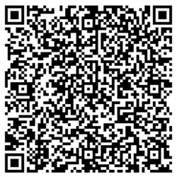
5. QR Code for Sourcing Transparency
Consumers are increasingly concerned about sustainability, and Starbucks meets this demand with a QR code on the package.
Scanning the code provides information about:
· Ethical sourcing practices
· Farmer partnerships
· Environmental initiatives
This is all part of Starbucks' sourcing and transparency strategy.
6. Ethical Sourcing Statement
Starbucks' pledge to ethical sourcing is prominently displayed on every package.
The commitment outlines the company's focus on:
· Economic responsibility
· Social impact
· Environmental sustainability
It's a crucial point of difference in a crowded coffee market where customers are increasingly concerned about where their coffee comes from and how it was produced.
Package Design as Storytelling
The artwork is an especially defining feature of the new packaging. The artwork is unique to each coffee blend and its story.
Examples include:
· Veranda Blend → Coffee growers and moments shared
· Pike Place Roast → Celebrates Starbucks' first Seattle location
· Caffè Verona → Lovers imagery from Verona, Italy
· Sumatra → Sumatran tiger, which represents source
This narrative-driven packaging turns brand packaging into an interactive experience, enhancing customer engagement with the story of the coffee.
Better in-store experience in the coffee aisle
It's not only about aesthetics, the packaging is also designed for better functional use.
Industry experts reveal:
· Most shoppers rely heavily on packaging when choosing coffee
· Simple icons and color schemes minimise shoppers' choice fatigue
· Clear displays increase visibility
Design and psychology come together to offer a better consumer experience.
Sustainability and Innovation
Starbucks remains committed to sustainability, and packaging is part of that commitment.
Key sustainability elements include:
· QR code information on sourcing
· Eco-sourcing statements on every package
· Continuous development of sustainable materials and designs
These measures are part of a wider trend towards sustainable packaging.
How to Select the Right Starbucks Coffee with the New Packaging
The new packaging makes it easy to choose your favourite coffee. Here's a quick guide:
1.Begins with the roast shade
· Light (yellow) for mild taste
· Medium (brown) for balance
· Dark (purple) for strong flavor
2.Read the tasting notes
· Look for ones you love (e.g., chocolate, citrus, spice)
3.Look at the format icon
· Check it's compatible with your brewing method Make sure it's compatible with your preferred brewing method
4.Scan the QR code (optional)
· Learn more about sourcing and sustainability
This efficient process helps you find coffee more readily.