Updated 2 月 ago
Ceramic Coffee Cups Explain (2026): Holographic Glaze Vs Classic
ypak.coffee
ceramic coffee cups
Ceramic coffee cups are no longer "just containers" in 2026—they shape temperature, aroma, mouthfeel, and even how customers remember your brand. For cafés and specialty coffee programs, drinkware has become part of the product itself. The cup is where a guest's hands meet your brand, where latte art becomes a photo, and where "this feels premium" turns into repeat visits.
At YPAK, we see the change in sourcing requests every month. Buyers are no longer asking only for capacity and color. They ask for cups that photograph well under café lighting, feel balanced in one hand, clean fast during rush hours, and fit modern interiors. That is why the conversation has shifted toward finishes—especially holographic glaze—while classic glazes remain a reliable baseline for consistency and scale.
Below is a practical, café-friendly guide to choosing between holographic glaze and classic finishes, and how to specify ceramic coffee cups that support both workflow and brand identity.
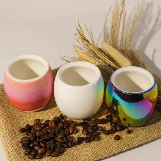
The 2026 Choice: Holographic Glaze Vs Classic
Classic ceramic cups communicate stability. They feel familiar, dependable, and "timeless." Many guests associate classic finishes with craft traditions: hand-poured espresso, careful milk steaming, and a consistent house style.
Holographic glaze sends a different signal. It feels modern, creative, and detail-driven—more like a design object than a commodity item. Under warm café lights, holographic surfaces shift color and reflection as the cup moves, creating the kind of visual "moment" customers notice instantly.
Neither choice is automatically better. The right answer depends on three things:
• Your menu style (fast service vs feature drinks)
• Your customer behavior (drink-and-go vs sit-and-savor)
• Your brand story (heritage vs modern concept)
For many cafés, the best approach is not "either/or," but "both": classic ceramic coffee cups for high-volume service and a signature holographic cup for hero items, seasonal launches, or premium sets.
What Glaze Really Does on Ceramic Coffee Cups
Glaze is not just color. On ceramic coffee cups, glaze is a glass-like surface layer that changes touch, shine, stain resistance, and how the cup looks across different lighting conditions. In daily café operations, glaze decisions can also influence perceived cleanliness, because smooth finishes wipe and rinse more easily, and they show residues differently.
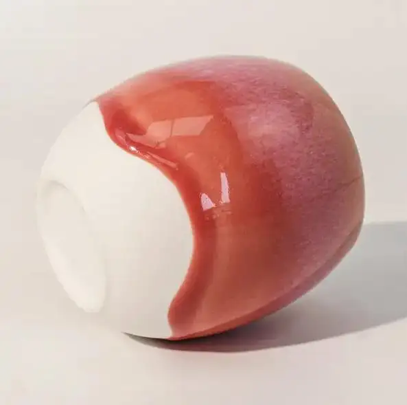
- Classic Glaze: Stable, Predictable, Uniform
• Classic glazes are designed for consistency. They typically deliver:
• A familiar reflection level (matte, satin, or glossy)
• Clean color stability across large production batches
• A dependable "set look" when cups are stacked, shelved, or displayed
For chains, hotels, and corporate programs, classic finishes are popular because they reduce visual variation across large sets.
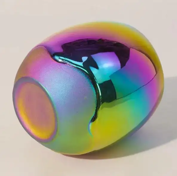
- Holographic Glaze: Dynamic, Expressive, Eye-Catching
Holographic glaze behaves differently from a standard single-tone glaze. Instead of reflecting light in one consistent way, it creates multi-angle reflection. As the cup rotates, the surface appears to shift—adding depth and movement.
This matters because many coffee experiences now happen twice: once at the table, and once on a phone screen. If your brand relies on visual storytelling, the finish becomes part of your marketing system, not only your tableware.
Practical takeaway: If your café designs for social sharing, your ceramic coffee cups are part of your content strategy.
Heat Retention and Why Temperature Still Wins Loyalty
One of the most common questions buyers ask is: "Will this keep coffee hot longer?"
Material and construction both matter. Ceramic generally holds heat better than thin glass and many single-wall alternatives, while staying comfortable to hold when wall thickness is designed correctly. In a café setting, the early minutes after pouring are critical—this is when aroma is most active and milk texture is at its best.
A well-designed ceramic cup helps keep temperature more stable during that first "golden window." The benefit is not only physical heat—it is consistency. Guests experience the drink as you intended, from the first sip to the last.
In 2026, expectations are simply higher. Customers notice temperature drop faster than brands think, especially in milk-based drinks where mouthfeel changes as the drink cools. Ceramic coffee cups that support thermal stability can reduce complaints like "it cooled too fast" and increase the perceived quality of the entire drink.
Why this matters: Better temperature stability protects aroma and texture—two factors customers remember even if they cannot describe them.
Shape, Rim, And Mouthfeel: Where "Premium" Is Decided
Many ceramic coffee cups look premium in photos but fail in real service because they ignore ergonomics. The most overlooked "quality signal" is the rim. Guests feel the rim before they taste the drink.
At YPAK, we often explain cup evaluation using four sensory checks that any café team can test quickly.
- Lip Feel: The Rim Is Your First Impression
A clean, even rim creates a smoother sip. It also affects how crema, microfoam, and aroma hit the palate. Small inconsistencies become "cheap signals" immediately, even when the coffee is excellent.
• Check: Run a fingertip around the rim—any roughness will show up in the drinking experience.
- Balance: How It Lifts Matters
A cup should feel stable when lifted with one hand. Poor balance leads to awkward service, spills, and an unconfident guest experience.
• Check: Lift with two fingers through the handle (if present) and feel whether it tilts forward.
- Inner Curve: Aroma And The Last Sip
A gentle inner curve can support aroma release and improve the last sip by reducing puddling at the bottom edge. It also affects how latte art sits on the surface.
• Check: After finishing, look at residue patterns—uneven pooling often indicates a less friendly inner curve.
- Handle Or Handle-Free: Modern Vs All-Day Comfort
Handle-free cups look modern and photograph cleanly. Handled cups support longer holding times, especially for hotter drinks and longer conversations.
• Rule of thumb: Handle-free styles can work well for espresso and short milk drinks; handled styles are often preferred for longer holds or hotter serves.
Classic shapes often win for speed and standardization. Custom shapes win for brand recognition. In premium programs, mixing both is common and practical.
Holographic Glaze in Real Café Use: Beyond "Decoration"
Holographic glaze is sometimes dismissed as decorative, but its functional value is differentiation. Under café lighting, each piece reflects slightly differently, creating a unique effect guests notice quickly. That matters in a crowded market where many drinks look similar online.
The key is to treat holographic glaze like a performance finish, not a novelty. A well-executed holographic glaze should remain smooth to the touch and feel comfortable in daily handling. The goal is a cup that looks high-end without becoming fragile or impractical.
In practice, holographic ceramic coffee cups often work best for:
• Espresso, flat white, and short milk drinks (where the cup is clearly visible)
• Signature drinks that deserve a signature vessel
• Seasonal launches and limited editions
• Gift sets and premium collaborations
If your interior style is modern and benefits from reflective accents, holographic glaze can make the table setting feel intentional and designed—especially when paired with clean plating and minimal clutter.
When to Choose Holographic Glaze Over Classic
Choose holographic glaze when:
• You sell signature drinks that deserve a signature vessel
• You design for social sharing and want a recognizable "brand cup"
• You operate a modern concept where visual detail supports the experience
• You want a premium upgrade without changing the recipe
Stay classic when:
• You need maximum uniformity across large sets
• You run a traditional brand identity with minimal design language
• You serve very high volume and want predictable replacement matching
• Your programs (hotel, corporate, institutional) prioritize consistency
A hybrid strategy often works best: one hero holographic design for branding + one classic backup for peak hours and operational stability.
How to Specify Ceramic Coffee Cups With YPAK
Good sourcing starts with clear specifications. To avoid surprises, we recommend a simple flow: define usage, define aesthetics, then confirm the tactile experience.
A Beginner-Friendly Specification Checklist
• Use Scenario: espresso, flat white, latte, tasting flights, or retail gift sets
• Capacity And Height: match your recipe and latte art style
• Glaze Direction: classic single-tone or holographic statement finish
• Rim Preference: thin refined rim vs slightly thicker comfort rim
• Handle Style: handled vs handle-free, plus grip opening size
• Logo Placement: front-facing, bottom mark, or subtle side branding
• Set Strategy: one hero design + one classic backup for peak hours
When possible, evaluate samples under your actual café lighting, not only in daylight. Holographic glaze can shift dramatically under warm bulbs, spotlights, and window reflections—often in a good way, but it should match your brand mood.
A Practical 2026 Recommendation: Build a Cup System, Not a Single Cup
Instead of searching for "the perfect cup," many cafés now build a small drinkware system:
• Classic ceramic coffee cups for speed, consistency, and replacement ease
• Signature holographic cups for hero drinks and brand recall
• A clear rule for staff on when each cup is used, so service stays smooth
This approach protects your workflow while giving marketing and customer experience teams a powerful tool: a recognizable vessel that customers associate with your café instantly.
CTA: Refresh Your Drinkware With Confidence
If you are planning a 2026 drinkware refresh, YPAK can help you compare holographic glaze vs classic finishes with sample guidance, shape recommendations, and custom branding options. Share your menu type and serving style, and we will propose ceramic coffee cups that fit both your workflow and your visual identity.
Related Articles

The 10 Best Cannabis Packaging Wholesalers to Dispensaries and Brands (2026).

The 10 Best Cannabis Bags Vendors to use in Weed Packaging (2026)

Top 10 Coffee Packaging Factory China (2026) Custom Coffee Packaging